This week, I started building something that might eventually become a marketplace.
Not a full-blown product just yet. No users. No billing system. No dashboard.
Just a humble, handcrafted frontend — and a clear intention.
I’m calling it Design Daily.
At its core, it’s a collection of clean, reusable UI components. Cards. Buttons. Forms. Toggles. Toasts. The kind of elements we rebuild endlessly across projects, because the basics are always needed, but never quite standardized in the way we wish they were.

Access the Marketplace: https://www.atulformarketing.com/design-daily-marketplace
This first version isn’t much more than a beautiful one-page gallery. But it’s also a seed. One that could grow into something surprisingly useful, not just for me — but maybe for other developers, designers, and builders too.
I want to share a bit about how this came together, where it’s headed, and why I believe this might turn into something that matters.
Why I Started With the Basics
There are a million component libraries out there. Most are tied to frameworks. Some are heavy. Some are opinionated. Others require digging through documentation or installing layers of dependencies before you even see a single button on screen.
And that’s not what I wanted.
I just wanted a place where I could grab a clean component — one that looks good, works across screen sizes, and can be dropped into a project with no fuss. Plain HTML and CSS. Maybe a sprinkle of JavaScript if needed. That’s it.
I realized I was remaking the same elements again and again: the same login form structure, the same toast message, the same profile card layout. And every time, I’d tweak margins, rethink spacing, re-align icons. It’s fine the first few times. But after a while, you start to see the value in having a base set of design primitives — elements that are already well-considered and can be reused without rework.
So I decided to build that library for myself.
And once I started, I couldn’t stop thinking about how this might help others too.
Designing the Marketplace (Even Before It’s a Marketplace)
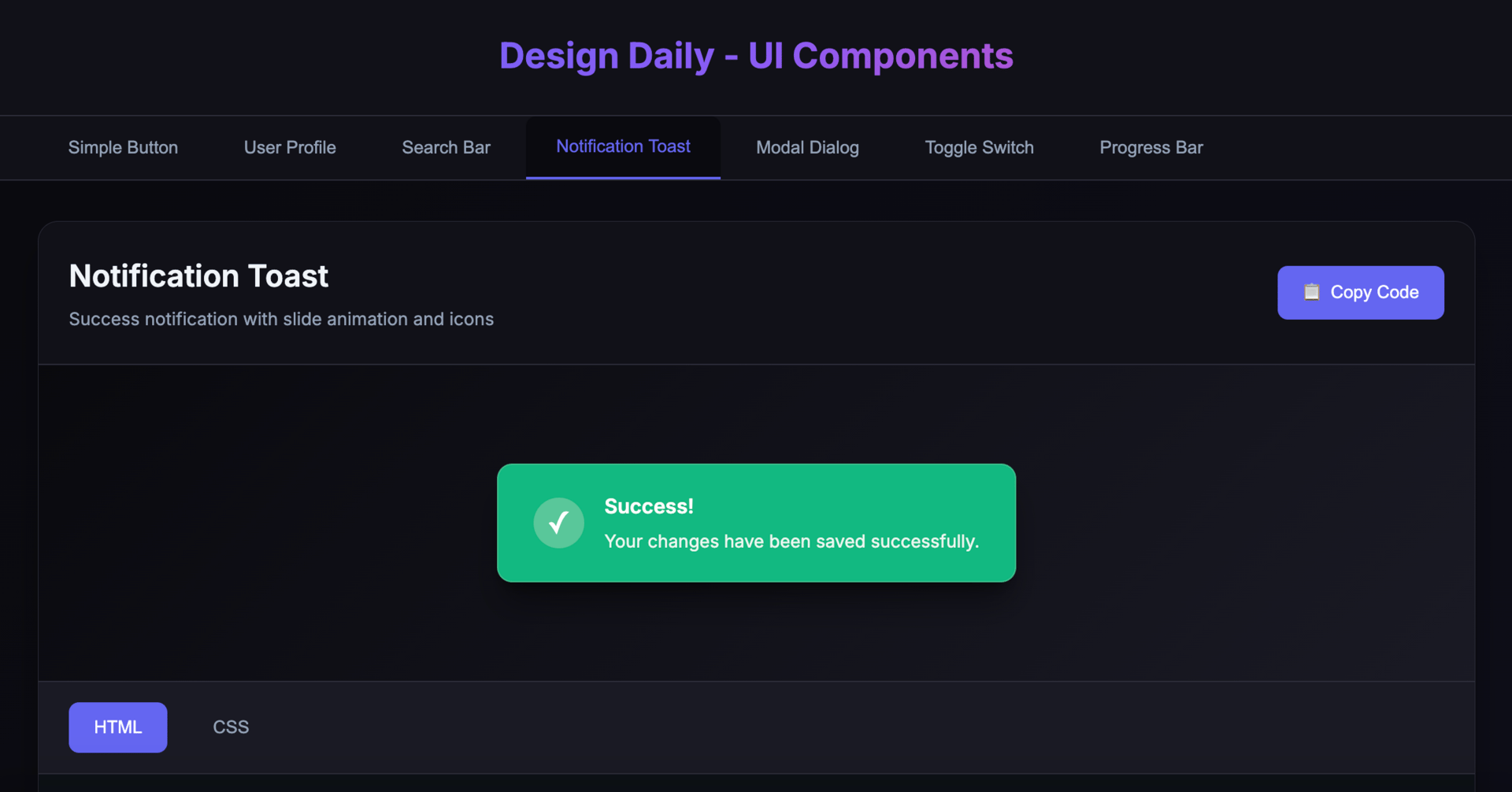
The current build is all frontend — one clean HTML file that loads components based on tabs. There’s a dark mode toggle. There’s a “View Code” button to show the HTML and CSS behind each design. It’s responsive, minimal, and intentionally quiet in its styling.
But even at this early stage, I’ve been thinking about it like a product.
Each component is treated like a piece of inventory. It has:
A name
A live preview
A code sample
A simple description
And (eventually) metadata like tags, categories, and accessibility notes
Because the long-term idea — or at least the idea I keep sketching in the margins — is to evolve this into a true marketplace. A place where developers and designers can:
Explore a wide variety of UI elements
Filter by type, style, use-case, or platform
Download components directly
And maybe even contribute or sell their own designs
Think of it as a lightweight, component-first version of what ThemeForest or UI8 does — but focused entirely on micro-designs, not full-page templates.
This isn’t about overwhelming people with 30 screens and 20 variations. It’s about surfacing just the element you need, exactly when you need it.
And it all starts with getting the basics right.
The Build: Simple on Purpose
Technically, the project is as lean as it gets.
It’s pure HTML, CSS, and vanilla JavaScript. I’m using Prism.js to highlight code blocks. That’s it.
You can check it out here:
https://www.atulformarketing.com/design-daily-marketplace
It loads fast. It runs locally. And it can be hosted on any static site platform without extra setup.
That decision was intentional. I didn’t want this to feel like a React playground or a framework-dependent tool. I wanted it to feel like something anyone could use, fork, or understand. Even folks new to web development.
But even in that simplicity, I’ve been thinking about structure. Each component is written in a way that could be abstracted into a database later. I’m already planning for the day when these are no longer hardcoded, but pulled from a CMS or JSON file. That makes it easier to scale to 100+ components — and eventually allow other creators to submit theirs.
Right now, I’m designing like a developer. But I’m thinking like a curator.
The Mission (for This Phase)
For now, I’m keeping the scope narrow.
The goal is to curate a beautiful, useful library of foundational UI components — the stuff that shows up in nearly every project.
A login form that just feels right.
A pricing card that actually looks good.
A toggle switch with micro-interactions that make it feel alive.
A progress bar that fits into any layout.
This phase — the library-building phase — will probably last a few months. I don’t want to rush it. I want each element to feel considered. Useful. Not just pretty for a screenshot, but genuinely usable in production.
That’s why I’m calling this Design Daily. Not because I’ll publish daily — but because it’s meant to be part of a daily design workflow. You visit, grab what you need, move on. It’s utility in the foreground, and style in support of clarity.
If this goes well, there’s room to expand. But first, the foundation.
What Happens After
If this gains traction — even quietly — I see a few directions it could grow into:
A downloadable kit of all components, ready to import
A live editor where you can customize component properties and styles
A contributor platform, where designers and devs can submit components for review
A premium tier with advanced UI kits or dashboard-style modules
Even a Figma integration or code-to-design bridge
But none of that matters yet.
For now, the focus is on doing the small things well. One component at a time.
Why This Matters to Me
We often chase the cutting edge — AI, automation, systems thinking, backends, databases. But this week reminded me that there’s beauty in returning to the fundamentals.
Designing a button that feels good to click. A layout that balances well. A card that just fits.
These things still matter. And I want to build a space that celebrates them.
So this is the beginning. A quiet one. But I have a feeling it could turn into something lasting — not because it’s ambitious, but because it’s grounded in something people actually need.
I’ll share the live version soon. For now, I’m just enjoying the build.
Thanks for being part of this journey.
— Atul